|
|
Post by ron on Mar 18, 2008 12:18:32 GMT -5
O K so here's the deal. I've just made my 'Bellatrix' blend for April's gdotm challenge.
U S U A L L Y i suck at graphics, but i am proud of this one, so i decided to make a tutorials!
Y A Y me!
S O here's the picture we are going to end with ;;
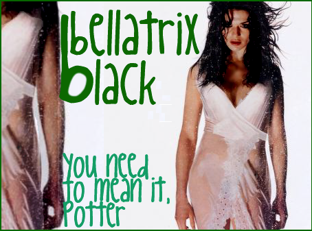
F I R S T step is if you get a picture of the person you want with a huge space beside them, than i find it easier than normal graphics.
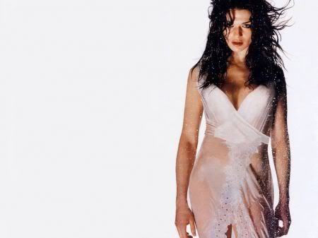
S O find a picture like the one I just explained ^^. Here's the picture i used ;;
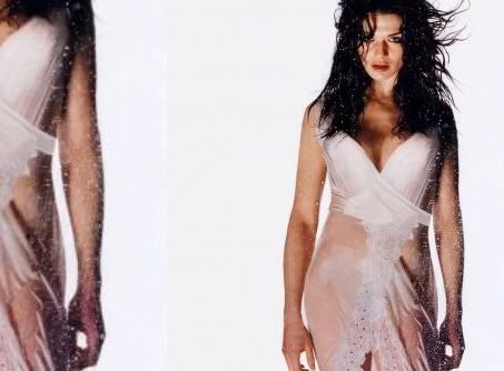
T H E N you take that same picture, but expand it so it's closer up. Don't show all of it, just so either the top or the bottom. So now we have this ;;
N O W let's all add text. Now I was making Bellatrix so I put her name. I also put a quote from her from the fifth book/movie . My font, by the way, is call King Cool KC, by www.dafont.com. So, with the text, it looks like this ;;

S O now we're basically done, right? NO! If you want to go now, then fine, but i wasn't happy with it just yet. So, to make me happier about it, I added a green border, the color of the Bellatrix text.
A L S O, i don't know if you noticed or not but, I darkened her body. I also darkened her eyes quite a lot, just to make her look more ... dark and scary.

S O , now we're done my friends. I will submit it to Aprils GDTM right after i have posted this.
|
|
|
|
Post by maxim on Mar 27, 2008 5:13:43 GMT -5
Ahh cool thanks Vee
|
|
|
|
Post by kyliewelbourne on Mar 30, 2008 19:01:23 GMT -5
1. Download Adobe Photoshop 6.0. You can get it free here. That might take a moment to download, but just be patient. It's all worth it.
2. Click 'File', and then 'New'. It works best if you already have your base image. I usually use some of these designs as my background for most of my graphics. Make sure you click 'Copy' on the image for the one you want, and then go click 'File', 'New' in Photoshop. The reason being, is that it will automatically size your window to the size of the base image.
3. Next, you need to find the images of your celebrity that you want. Copy and paste them one by one into your photoshop window. Do this by clicking 'Edit', 'Paste' into the direct window of your base image. After you get all of the pictures on there, continue to step four.
*To change from picture to picture (aka Layer to layer), look at the bottom right of Photoshop. There are many small windows on the right side of the page, and look for the one that has tabs reading 'Layers', 'Channels', 'Paths'. There, click on the different layers. ('Background', 'Layer 1', 'Layer 2', etc.) Once you click a layer, all of your editing will be done to that layer only. (erasing, blurring, cutting, etc.) If you want to go to a different layer, simply click it.*
4. I always erase parts of my pictures. Do this by clicking on the layer you desire to erase, and then look for the button on the LEFT side of the screen with all the other little buttons that control editing. Look for the eraser icon, right above the one that looks like a teardrop. Click it, and then use it on the desired layers. To change your brush size, look at the top of the screen under 'File', 'Edit', 'Image', etc. You will see the thing that says 'Brush', and right beside it is a drop down arrow. Click the arrow, and choose the desired size. As you can see, I always erase the backgrounds of all my pictures. Basically, everything except for the body of the person. That way, it's just the people and the base image. (Look at my current siggy for an example).
5. Once you're satisfied with the new pictures, arrange them how you want them to look on your final image. Don't forget to switch between the layers. Basically right now, you're putting the pictures in the place you want them to be at the end.
6. Once you're happy with that, continue to add extra effects. This part is optional of course, but I always do some. I use these as my textures. Just copy and paste the image, and then at the top of the page, click 'Layer', then 'Layer Style', then 'Blending Options'. Ignore all the little things on the left of this window. But in the center of it, look for 'General Blending' and then 'Blending Mode'. Click the arrow, and then experiment with the different ways to dissolve your image. I usually go with 'Multiply' or 'Soft Light'. But it's just your personal preference.
*If you want to add text using photoshop, click the big 'T' on the left side of the screen with all the other icons. Make the text box, and then enter your text. At the top of the text wizard up under 'File', 'Edit', etc, you can select your size and font. Once you get that part, click the check at the right. Then, go to the icon that is the second on the first row at the left of the screen. It looks like a little arrow with a plus sign. Click that, then go up to 'Layer', 'Layer Properties', 'Blending Options'. Once again, select the one under 'Blending Mode' that you like the look of. Once finished with that, click okay.* (I usually do my text a different way. It's explained below)
7. Once you are completely happy with your ENTIRE image, press the 'print screen' button on your keyboard. (Sometimes as 'prt sc') Once you have clicked that, click 'Start', 'All Programs', 'Accessories', 'Paint'. Once you go into the Paint program, click 'Edit' and 'Paste'.
8. On the left icon menu, you will see one that looks like a rectangle, but it has dotted lines. Click that. Then, select around the image that you want as your graphic. While it is still selected, click 'Edit', and 'Copy'. Then, up at the top of the screen, click 'File', and 'New'. There is no need to save this image. After in a blank document, click 'Edit', and 'Paste'. From there, click 'File', and 'Save'.
9. Now, all you have to do is upload your image! Photobucket, imageshack, whatever. BUT: If you are wanting to do your text NOW, you MUST go here! Yes, it requires setting up an account, but it is all worth it. Once you have an account, go to the homepage and click 'Browse'. Select the image that you just saved in paint. Then click 'Upload'.
10. After it uploads, you might be happy with the size as is. If so, click 'Save to Account' just under the image. But, if not, look at the left icons menu. Click the middle icon on the fourth row down. It looks like one box getting bigger/smaller (just however you look at it) with a small arrow. Once you click it, set the new width of your image. It will automatically set the height in proportion to your new width. Click 'Scale Image' and your done. If you already have your text, this is the time to click 'Save to Account'.
11. If you haven't done your text yet, click the big obvious 'T' in the icons menu. Enter your text, set the color, size, etc. The font I regularly use is called 'Scriptina'. Give it a second, and the text should appear on your image. Move the text around to the place that you want it, and then click 'Apply Text'. After that, the text menu will still be up, but it already has your text. Scroll all the way to the bottom of the page and click 'Save to Account'.
12. As you notice when you save it, it automatically takes you to your new 'library' or whatever. It's just the images that you have saved. Find the image that you want the code for, and then click 'Code' underneath it. Scroll down to 'Direct Image URL', and copy it.
13. Finally, put the URL where you want it. Sig, avatar, etc. Wa-la! You're finally finished!
I know it's a long process, but after you do all the downloading and account making the first time, it doesn't take as long in the future. Hope this helped.
|
|
|
|
Post by ``misturrrrr.frankie.deluca on Apr 9, 2008 6:43:01 GMT -5
|
|
|
|
Post by sydney on Apr 9, 2008 6:52:46 GMT -5
|
|
|
|
Post by ``misturrrrr.frankie.deluca on Apr 9, 2008 6:55:30 GMT -5
ahhhh! Syd, I love you so much now!
*hugs her tightly* [/size][/blockquote] |
|
|
|
Post by sydney on Apr 9, 2008 6:59:22 GMT -5
Haha.
No prob!
-hugs back-
xDD |
|
|
|
Post by ronniexo on Apr 10, 2008 3:00:34 GMT -5
Scarlett asked for a few tutorials, and here I am with just one of them. xDD
We're going to be making this :
Get your image first: here. Click on the thumbnail to get the large image. You're also going to need a texture. Take this brush from ownthesunshine@lj.
Warning: the result from this tutorial will not be exactly the same as what I made, but it will be very very similar.
1. Fill your first layer with a brown. I chose AF8B63.
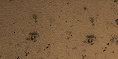
2. Get your texture, paste it into your file as layers 2 and 3. Set both layers on multiply. Move layer 3 around so it isn't corresponding to layer 2.
So far, you should have:
3. Paste your image in and shrink it, using Edit --> Transform --> Scale until it fits the right side of your signature all nice and comfortably. Use layer masking [as described in the general tutorial] to get rid of the green parts on the left. Duplicate this layer and set the duplicated layer on Screen at 37% opacity.

4. Now the coloring. This is going to take forever, I warn you. --cringes--
4a. Go to Layer --> New Adjustment Layer --> Selective Coloring [ONLY FOR PS USERS. Sorry PSP users!]
Set your settings to this:
Reds: -100, 8, 8, 0
Yellows: -100, 0, - 33, 0
Whites: 0, 0, 20, 0
Neutrals: 14, 0, 0, 0
4b. Another Selective Coloring [SC] layer.
Reds: -14, 0, 22, 44
Yellows: 100, 7, 0, 0
Cyans: 100, 0, 0, 100
Whites: -37, -8, 9, 26
Blacks: 0, 0, -48, 100
4c. Yay, another SC.
Yellows: 0, 0, 43, 29
Whites: 100, 0, -35, -27
4d. One other SC layer.
Reds: 0, 0, 0, 36
Yellows: 100, -1, -60, 0
Blacks: 0, 0, -38, 100
4e. Woo, another one!
Yellows: 28, -7, 9, 0
Whites: 0, 0, -24, 0
4f. This time [surprise!] it's a Curves layer. It can be found in the same window as the Selective Coloring adjustment layer.
Greens: put a dot at input:93, output:85
Blues: two dots; one dot at input-82 output-90, another at input-200, output-190
4g. It's back to SC!
Reds: 49, 0, 33, -21
Magentas: 0, -100, 0, 0
4h. ONE LAST SC LAYER, THANK GOD.
Reds: 33, 0, -16, 0
Yellows: 0, 0, -26, 0
Whites: 0, 0, 20, 17
Blacks: -16, 0, 100, -5
It should look similar to this:

5. After the exhausting coloring, duplicate the layer with the image again, bring it all the way to the top, and set it to soft light at 37% opacity.
6. Duplicate the same image again, and desaturate. [Control - Shift - U] Go to Edit --> Transform --> Scale, and WHILE HOLDING SHIFT, drag one corner down. It'll get smaller. Move it over to the left of the colored image slightly, and set the entire layer on lighten.
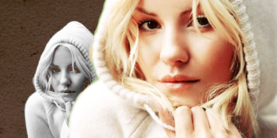
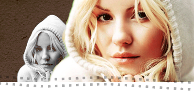
7. Create a new layer, and get hold of your rectangular marquee tool [top left]. Drag to form a rectangle at the bottom of your signature. Fill [using the paint bucket or going to Edit --> Fill] with a white color.
8. Get the brush and click once. [If you need help installing the brush, PM me and we'll go through it together. :]]
9. TEXT TIME! I trust that you know how to do the text - mine wasn't any special, really - so this tutorial shall end here.
|
|
|
|
Post by maxim on Apr 16, 2008 10:17:50 GMT -5
Any Paint Shop Tutorials onwards?
|
|
|
|
Post by fouziyeh on Apr 19, 2008 12:41:38 GMT -5
Does anyone know of any GiMP or Translated Tutorials for GiMP? Because the one's that I found, they're getting boring now and I don't know where else to look.
|
|
|
|
Post by Shade Antoine Day on Apr 19, 2008 13:26:28 GMT -5
hm. I use GIMP most of the time.
&& I've been thinking about making a tutorial.
But as of now I haven't.
Anyway, usually I just read Photoshop ones and do the best I can.
My mom has Photoshop, and I use it once in awhile, but I truly don't like it much.
If you know how to work it, GIMP can to nearly everything that Photoshop can. |
|
|
|
Post by fouziyeh on Apr 19, 2008 14:00:54 GMT -5
GIMP can to nearly everything that Photoshop can. I agree. Though GiMP doesn't have selective colouring, Channel mixer is kind of like it if you put the right numbers in  |
|
|
|
Post by emily r a n a stanton. on Apr 19, 2008 15:15:24 GMT -5
I'm soon to have another tutorial up when i can make a good enough graphic to do a tutorial. But as shade said, i just follow the photoshop ones.
|
|
|
|
Post by alegra bell on Apr 19, 2008 16:49:27 GMT -5
psp tutorial!!
should be able to do on other programs as well
Well, since someone asked, I'm going to give this a try. I'm using Paint Shop Pro 11, but it should be translatable. Use for any program? I'm not sure. (: Keep in mind that this coloring only works well if your image is high quality. You can try with lower quality, but don't get mad at me if it doesn't work ><` So I'll be making a Hannabeth sig. Why? She has many many high quality images. (: So you take this picture. Make a 400x200 canvas. Drag the image [full size] over to the canvas, then resize it. I resized it by 60 percent. Then I flipped it [mirror] and dragged it over to the canvas. I position them, and blend. It should will look like this:  If you highlight it, you'll see that there left side is transparent. Thats just how my bg is. xD Just color that in in the gray of the bg of the origional pic. Then its full. So now coloring. I don't have selective coloring on this, so I did something else. COLOR BALANCE and CHANNEL MIXER. HERE IS THE PSPIMAGE FILE! Just download that, then drag the color layers over to your blend. Read the rest for info. *nods* So here, we'll make a color balance layer first. Layers → New Adjustment layer → Color Balance. Probably different for yours. You'll see three bars, all set on zero. Take the first one, Cyan - - Red, and move it all the way to the right. You'll see the numbers on top, 100, 0, 0. You can change that as well. Then change from Midtones to Shadows. You can find it, for me, its along hte bottom. Just click there. Do the same for Shadows that you just did for midtones. Then the same for Highlights. Leave the preserve luminance checked and click ok. It should look like this:  Then you make a NEW color balance layer. Layers → New Adjustment layer → Color Balance. Set the color levels to 0, 2, -100. Then go on shadows and set the color levels to 0, 0, -100. Highlights, 0, 0, -100. Leave the preserve luminance checked and click ok. Now it should look like this:  Don't worry about the ugly of the color yet. It will be fixed later. Then make a THIRD color balance layer. Sick of this yet? Midtones: 0, 100, 0 Shadows: 0, 100, 0 Highlights: 0, 100, 0 Leave the preserve luminance checked and click ok. now its more yellow and should look like this:  .. ugly thing, isn't it? Now for the red part. *nod* NEW COLOR BALANCE LAYER! Midtones: 100, 0, 0 Then don't do anything else. Leave the preserve luminance checked and click ok.  Now you need to duplicate your base, set it to screen and leave it just over the base, then dupicate your base again, drag it all the way to the top, and change the opacity to 68 percent! Now it looks like this:  Not that bad, hey? >< Well, now we need a channel mixer layer. Layers → New Adjustment layer → Channel Mixer. RED: channel output: 165 -69 0 GREEN: 0 100 0 BLUE: 0 0 100 DO NOT CHECK THE BOX THERE [Monochrome] Click ok. Now it should look like this:  Now the coloring is done. (: Doesn't it look fabulous? ><`` I suggest you flatten the image and sharpen. So now we need texture and text. (: I used this one, a notebook texture, and dragged it over to my siggy. Set it to darken, and erased the parts on her face. Now it should look like this:  Then I used a scratchy texture, this one, dragged it to my image, and set it to screen. Now only the white scratches show. (: Should look like this:  To spiff it up a bit, I added a handwriting texture. this one, set it to screen, moved it so the most part was on the paper, and lowered the opacity. I set mine on 34%. Then I erase a lot of it until it was only showing on the paper part of the image. Should look like this:  Well, now this is good enough for me. Now we need text. Once that is good, then we're done! So I took a georgia font, put it on bold and italic, and size 30 px, and put 'miss' in black. #000000 Place it at the top corner-ish.  And since this is hannabeth, I shall put her name on it. I used the font ' Honey I stole your Jumper ' from Dafont.com, and left the size. I took the color of her sweater and put the text. I played around with the positioning.. (: AND NOW I'm FINISHED! Tada!  If you have any questions, feel free to ask. (: |
|
|
|
Post by ohmykevinjonas on Apr 24, 2008 9:47:13 GMT -5
I know probably no one will have a reply to this, but does anyone happen to have any tutorials for PhotoFiltre? I don't have PF Studio, I have the free one <3. I can only make a few decent pictures, as you've probably noticed. I used Photoshop in school, but other than that and PF I don't have any real experience with graphics[my older brother, who's eightteen brought home photoshop but i really don't get it. It's not the version we have in school, so I gave up learning with that one.Plus, My friends have helped me with some graphics on myspace, but not too many.]
|
|