|
|
Post by mme. o. maxime on Dec 11, 2007 13:48:53 GMT -5
Ok so I've started a couple of these and I know some other people have but they get lost in all the posts and eventually sent to archives. So I thought that this time I would sticky it. Feel free to give us sites to any tutorials, textures, brushes and so on. Or post and give your own advice on something. Share with us your knowledge lol.  |
|
|
|
Post by melodramtic on Dec 13, 2007 1:13:52 GMT -5
-cracksknuckles
i'll take a shot at this =]
lets see
first of i have Adobe Photshop Elements 3.0
and i don't know about any other photoshops
like how there different or not
kk
say you get a pic like this 200x200

[becky lou filip]
1]go to layer>duplicate layer
2]with the bottom layer go to filters>blur>Gaussian blur
2.5] enhance>color variations>click increase red, decrease blue.
{this step is skipable, i just like it xD}
3] with the top layer make the occupancy 60%
you should end up with
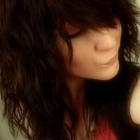
1]Add textures, brushes, what not, don't over do it unless you really know what you're doing,
or you just having fun.
2] image>resize> image size> height:100px and width:100px
so now you have an avvie
[ohkay thats not the best avvie out there xD
but truth is i just made this up as i was going along
&& this is my first avvie so be greatful!]
i do the this to all my siggs
{except for the resizing}
so i figured you'd all like to know
^^
|
|
|
|
Post by ronniexo on Dec 22, 2007 9:02:12 GMT -5
Mmkay, my very first tutorial ever. :] This is to help, not for people to copy. If you make something exactly like this, I will go hunt you down. This is simply for learning and reference. Now let's get on with it.
NOTE;; To get to Hybrid Genesis' textures, you must type in hgtextures as the username and freeaccess as the password. Because I realized some of my links went haywire - uploaded them to my photobucket.
We will be making this:
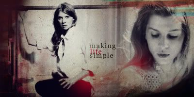
From:
 and and 
[From poesy.fan-sites.org/gallery/]
Step One;;
Desaturate the colored image, first things first. Flip the image where Clemence is bending down horizontally. Blend the two images together. I always use the soft, round erasers to erase bits of this image, bits of the other and then they blend perfectly.
Step Two;;
Duplicate each of the two images three times. Set the first layers as 'Normal', the second as 'Screen' and the third as 'Soft Light'. Alter the opacities as you wish.
This is the outcome so far:

Step Three;;
Grab this texture from Hybrid Genesis and desaturate it. [Shift-Control-U] Scaled it down so that the black bits covered the two corners. Erased the parts obstructing the images, and then duplicated this layer again. Set both layers to multiply.
Outcome:
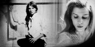
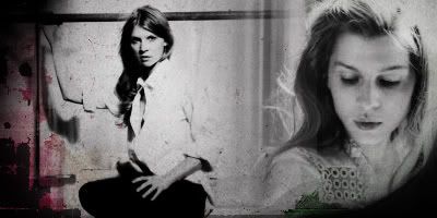
Step Four;;
Took also from Hybrid Genesis and pasted it into the file three times. On the first layer, I moved the texture so that the pink line was on the left. On the second layer, I also moved it so that another black and pink part was on the left. On the third layer, I moved it so that a pink rectangle and a green rectangle was visible on both the left and the right sides. [Sorry if this is confusing - all you really do is move it, with trial and error]. Set all three layers to multiply and erase obstructive parts. I added this step because I wanted some color in the graphic, not just plain black and white.
Outcome:
Step Five;;
Another texture from Hybrid Genesis! Moved it a bit and tried to see which blend mode was the best. In the end, I settled with Soft Light, opacity 100%, with parts erased.
Step Six;;
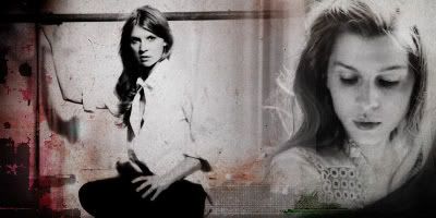
Another one from - you guessed it - HG. Desatured it, erased most of it, leaving only a slight bit of the bottom showing. Set the layer on multiply.
Outcome:
Step Seven;;
Will I ever get tired of HG? Afraid not. xDD This texture, this time. Duplicated it once and moved them around, until it was only slightly covering the top right corner and the side. Set both layers to multiply.
Outcome:

Step Eight;;
Finally, one of my tricks. Get a new layer. Select a dark blue color, fill the entire layer with that color and set the layer to exclusion. Don't make the blue too light or too dark - just right. It will give the graphic that old paper yellow tinge.
Step Nine;;
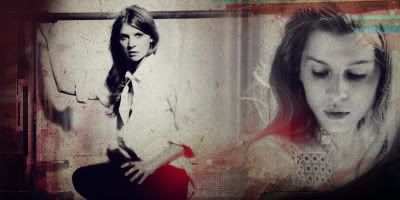
Get a new layer. Select a red color, whatever you want, and use a soft round brush and randomly blob it over the graphic. Choose places dark. I chose bits of Clemence's hair and her arm. Set the layer on lighten, and BAM, you've got a beautiful red tinge on those spots. Fiddle with the opacity if you wish.
Outcome:
Step Ten;;
Time for some text! Because the requestee wanted 'making life simple' I did so. I typed 'making' with black, in Georgia size 14 and set it on Soft Light. Duplicated the layer.
Then I did 'life' in the same red as step nine, in the same font and size and left it on Normal.
I then finished 'simple' the same way as I had done 'making'.
AND YOU'RE DONE! A beautiful graphic! <33

Feel free to ask questions! |
|
|
|
Post by ronniexo on Jan 19, 2008 8:58:05 GMT -5
TUTORIAL #2.
In this tutorial, I'm going to teach you how to make this banner which I made for the Banner Contest. It's my most recent banner, so I think I can remember what I did. I will be assuming you know the basics of Photoshop.
Banner.
The same guidelines from my previous tutorial applies. Don't copy step by step, or I will hunt you down and chop you into a million pieces. It won't be such a sight. Use this tutorial to develop your own style and your own graphics. Feel free to post your results.
Credit to the images go to Corbis.com. The tiny text brush is from colorfilter.net. Texture from loveicon. Pattern by Hybrid Genesis.
Step 1.
Open a 700x200 canvas. Simple. Fill with the color #1F1505. Anything dark works as well.
Outcome.
Step 2.
Get the pattern. Select all [Ctrl A], then go to Edit --> Define Pattern. Then, in your canvas that you were just working on, go to Edit --> Fill, on a new layer. Choose the option that says 'Pattern'. Set the mode of this layer to Soft Light. Duplicate this pattern layer and change the mode of this duplicated layer to Multiply.
Outcome.
Step 3.
Randomly select a rectangle and fill it with white.
Outcome.
Step 4.
Get your two images, blend them together. [I'm not going into detail, as blending was already discussed in my previous tut.] Leave some space on the left. Looks more stylish that way. :]
I set my mode to Darken.
Outcome.
Step 5.
I got a Brightness/Contrast layer, and adjusted the settings slightly.
Outcome.
Step 6.
I did some coloring. A few steps, I followed a tutorial which I lost the link to so I'm not going to list all my steps. Basically, fiddle with color layers and Selective Coloring, Curves, Hue/Saturation. Since I was aiming for browns, I got this.
Outcome.
Step 7.
I made a black box on the left side of the images, covering a bit of the white and a bit of the images.
Outcome.
Step 8.
I used my tiny text brush [any one will do].
Outcome.
Step 9.
Put the texture on, and set the layer to Lighten at 55% opacity. Erase the bits that are obstructive.
Outcome.
Step 10.
And then text! 'Beauxbatons' is in Violation, in white, at 35pt, 100 tracking. 'academy of magic' is in Palentino Linotype, 13pt, 300 tracking.
Outcome.
Step 11.
One final layer of black, set to Soft Light because I wanted the entire graphic to be darker.
Banner.
And viola! Finished. :] [/blockquote] |
|
|
|
Post by emily r a n a stanton. on Jan 26, 2008 14:37:44 GMT -5
THis is my first tutorial so if it's confusing please tell me. I used gimp for those who can't afford PS. THis is also good if you don;t really understand layers
Step 1. Choose your two images.
Pic 1
Pic 2
Step 2.Make your canvas to fit the smaller image and then double the width.
Step 3. Because Photobucket does not support xcf files, i selected the two pictures and pasted them in paint, save and uploaded.
So far
Step 4. Then i created a 2 NEW canvas in gimp and make the dimensions to fit the image perfectly.
Step 5. Paste the uploaded image to the first canvas. Then use the magic wand tool to get rid of the background to each image. make sure to not to fet rid of any of the person. If you still have small blotches of background use brush size 07 with white to color over them
Step 6. Then paste the image to the right into the second canvas. Don't move it.(with the move tool)
Step 7.Go to the second canvas. THere use the magic wand tool to select the person only. Cut it. Make sure you have 98 % of the image. If there is just a very faint part of the picture left, that won't effect it.
Step 8.Paste the image on the first canvas. There will be a light film over the left side image.
Step 9.Select an area of the image leaving a small border around the edges. Click the dashed quickmask button on teh bottom left hand side.
Step 10. Go to Filters>Noise>Spread then Click the dashed quickmask again. Then go Select>Invert
Step 11.Go to your task pane and click the bucket. Click pattern fill and choose Nops. Then On the image screen click Edit>Fill with Pattern. Click the rectanglular select tool.
So far
Step 12.Add Text. Now to upload to tinypic.com or paste into paint,save upload to Photobucket
Final Product
|
|
|
|
Post by alegra bell on Feb 21, 2008 15:54:57 GMT -5
Layering has everything to do with making graphics. If you want to add a texture like Vee does and a majority of other members, you need layers. Read her first tutorial. She erases parts in a lot of the textures. You can't do that without layers. ><
Otherwise you are erasing the whole of the graphic/picture. |
|
|
|
Post by ronniexo on Feb 23, 2008 3:18:21 GMT -5
` ` g e n e r a l g r a p h i c s t u t o r i a l ; [/center] This time, I'm not going to go into the step-by-step processes of making a signature - or, in fact, any type of graphic. I'm going to simply state the general guidelines to making them. Hopefully they'll help some of you, since I know that quite a lot of you haven't had the experience working with a graphics program and, hence, do not understand what I'm talking about when I say things like 'Soft Light' and 'Radial Blur', or 'Selective Coloring' and 'Desaturate'. If you do, kudos to you! :] If you don't, just follow along and I'll address these matters. And remember, these are mere guidelines that I find are important. They aren't rock-solid - rules and the such were meant to be broken!
Also, keep in mind that I use Photoshop 5.5. Most tips will work for every program, but there's only Selective Coloring on PS.
I M A G E S;;
Possibly the most important aspect of a blend, signature, or icon. Images can make or break a graphic. Unfocused and blurry images will do no good. Oversharpened ones will also ruin your graphic as well. There are guidelines which I follow everytime I make graphics:
1. Pick large images from photoshoots of the celebrity's gallery. Usually, images that are larger than 700x500 are good enough. Do not use the images that are only 500x300 unless they are very high quality and are crucial to your blend. If not, try to avoid using small images - it just makes more work for yourself. If you are looking for stock images, look on veer.com or somewhere similar. DO NOT search on google.com images. Not only are they of poor quality, but you won't be able to find as much of a diversity of images as a gallery of stock image site.
2. When considering the good images to use, keep in mind that it is not required to use more than one image. If you only use one, it won't look horrible. However, on small-scale productions like icons and signatures, it is unwise to use more than two images - period. Once you start adding three images [and I'm saying different images, not three of the same image], the signature/icon will look crowded. On the other hand, if you are making a blend, usually aim for three-four images, unless you are repeating the same image over and over again, like I do on my blends. So remember, limit your choices to the best 1-2.
3. Once you have chosen your image, you must decide to scale down or to leave it be, and then SHARPEN. It's crucial to every blend to sharpen your images first, unless you have some crazily high quality images. However, beware of the act which is OVERSHARPENING. When you start seeing odd patches on a person's skin and you start seeing individual pixels, you've oversharpened it. To prevent this from happening, what I do is that I duplicate my image and name it 'layer two' or something, sharpen layer two by going to Filters --> Sharpen --> Sharpen OR Filter --> Sharpen --> Unsharp Mask. I usually chose the Unsharp Mask option because it gives me even more control over the sharpness of my image. Set layer two on screen or soft light and lower the opacity. You will achieve an image which isn't too blurry but isn't overly sharp. Perfect!
C A N V A S S I Z E;;
A signature that's 500x400? A banner that's 800x300? Quite impossible, unless you have a unique demand for such sizes.
SIGNATURES are usually of a size around 400x200 [the size I use on all of my signatures], no less than 400x150, no larger than 500x300.
ICONS can be of any size, from 100x100 to 400x400. 100x100s are the most common. They are squares, though, keep that in mind.
BANNERS are typically of a size that is 700 in width and in a height of your choosing - 100, usually.
BLENDS can be ANY SIZE AT ALL. However, anything smaller than 500x400 is a tad on the small side of blends.
WALLPAPERS are usually either 800x600, 1024x768, or 1280x980, for those with huge monitors. 800x600 are the sizes of the older monitors, while most monitors these days have a resolution of 1024x768 or higher. Making anything larger than that, however, will be very difficult.
B L E N D I N G / I M A G E P L A C E M E N T;;
Ever seen those pretty blends where there are a gazillion images moulded together seamlessly and thought I wish I had those skills! Or have you ever seen a collage where the images were placed so effectively that you just couldn't stop looking? Those were most likely blends and image placements done excellently.
Though I cannot claim to be the best at this area [far from it, actually], I do have some tips and some general facts that could help you.
1. BLENDING.
There are a variety of ways to blend. I'm only going to state the ones that I find most useful.
Erasing.
The easiest form of blending: having layer one with your first image, layer two with your second image, and grab a soft, 100-300px wide brush and simply erase from both layers until the images blend into each other. Simple. :]
Layer Masks.
Perhaps the most useful creation and device on photoshop. You see that button dooooown on your layers palette, the one furthest left? Have you ever used it? That useful, nifty button creates a layer mask for each layer you want a mask on. Click it, and you will see that your layer, layer one for example, has suddenly had an extra part attached to it. It's all white at the beginning.
How you use it is very very simple. Click on that mask, and your colors will instantly change to black and white. You can't use any other colors on your mask unless you want them to be changed into black and white immediately. Grab a brush from your brushes palette, and select black if you haven't already. Color, on your layer mask, the parts you want to get rid of of the image on your layer with the brush.
Let us use one of my works as an example.
CLICK.
I used tons of layer masks in this one. Take a look at my layers.

The highlighted parts are the actual layer masks. The bottom left button is the layer mask button. [Remember, I use PS5.5, so the button might look different, but it should still look similar.] You can also see that I colored all over the layer mask in black to get rid of extra parts of images that I didn't want.
2. IMAGE PLACEMENT.
This can be very hard to grasp when you are just starting, but after a while of practice, you will undoubtedly improve. For image placement, there is one thing that should be done every single time you make a new piece of work: try every single spot until you are happy. In fact, sometimes images just don't work together and must be discarded. In that case, you must start over again - there's no other way. Don't force yourself to put together something that looks horrible.
Also, keep in mind this solid rule LESS IS MORE. It isn't always better to have many images all over the place. Empty space can be effective and pretty, too!
There are many different ways of putting the images together. I'll provide some examples of my own.
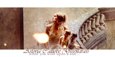
The images are placed all together in the middle. Some are smaller than others, and they are all positioned slightly differently. That is one way to place images.

Another way: one behind the other.
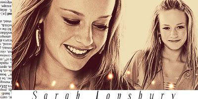
Next to each other, but different sizes, which creates depth - the right image looks like it's behind the left one.
Those are just a few, and there are an infinite number of ways to put things together. Just make sure it looks good.
C O L O R I N G;;
Coloring is a crucial step in every piece of work you do. It makes certain colors and shades pop and makes the piece unique. If you do not do coloring, your graphics will look very bland indeed.
I'll give you a good example of an icon that I made [okay, I admit that my icons aren't so great];
I made
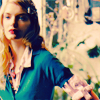
from
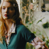
which is the original base, cropped by yours truly.
Another example, a bit better:
 into into  . .
As you can see, there is a major difference in colors and sharpness - I'm afraid my icon might be a bit too sharp, but I'm not so great at icons anyway - and that is where coloring plays in. There are many, many ways to color an image. The most useful tools, however, and the things I use the most are Selective Coloring, Curves, Hue/Saturation, and Brightness/Contrast. Don't know what I'm talking about? Well, these four adjustment layers can be found in Layer --> New --> Adjustment Layer OR you go to that little arrow right beside 'paths' on your layer palette and choose 'New Adjustment Layer'. The same popup will come up. All four of the aforementioned layers should be there, along with other things like Levels and Colour Balance and Channel Mixer, which I don't use too often.
Selective Coloring.
Probably my most favorite tool to use when I'm coloring something. It's very very useful. Fiddling around with it will make you realize what it does, but I'll give you a small overview here first.
When you get to the Selective Coloring pop-up, you'll probably think 'WTF?' Don't fret. It's simple, trust me.
You'll have a selection as to whether or not to choose Reds, Cyans, Greens, etcetc. When you choose one of the colors [besides Neutrals, which basically means... everything], you will be selecting the parts with those colors. For example, if your image has a blue sky, then, to change the colors of those areas, you will choose the 'Cyans' or 'Blues' option. Choosing 'Blacks' will not change anything on the sky.
Once you have selected the correct color, you will then see sliders that states 'Cyans', 'Magenta', 'Yellows', and 'Blacks.' Let's use the blue sky example again. Increasing the 'Cyans' will make your sky much bluer, while decreasing the 'Cyans' will make your sky more red. More Magenta, more purple; less Magenta, more light green. More Yellow, more yellow [duh]; less Yellow, more dark blue. Black can make your color darker or lighter.
The two icons above used a TON of selective coloring, as well as the next layer I'm going to talk about: CURVES.
Curves.
It's not used as often as Selective Coloring, but it's just as useful. You'll see four drop down options: RGB, Red, Blue, Green. On each of them, you see this graph-like line. Click on it, and a point will be generated. Drag the point up, down, sideways, watching the graphic change in terms of color. I can't explain too much about it, but having a point on the upper half of the graph will increase the color/lightness that you chose [Red/Blue/Green], moving the point downwards will take out that color and make your piece darker, overall.
It requires practice to be able to use this option more adequately.
Hue/Saturation.
Hue is another word for color. Saturation means how 'full' your graphic is full of a specific color. Or, according to dictionary.com, 'To soak, fill, or load to capacity.'
You have specific channels, as well, as you do in SC or Curves: RGB, Red, Green, Blue.
Increasing Hue will change the color. Increasing Saturation will make the colors stand out even more.
Brightness/Contrast.
Pretty self-explanatory. Usually, to achieve bright and yet sharp images, I increase both Brightness and Contrast, because sometimes if you increase Brightness only, you lose a lot of the contrast.
B R U S H E S;;
Though excessive brushwork is a definite no-no and looks extremely tacky, small additions with brushes like tiny text, splotches and otherwise decorative elements can fully enhance your graphic.
There are many sites which provide brushes for you to download, like echoica.com or hybrid-genesis.com, but be smart when choosing the brushsets that you want to use. Don't choose things that you know you won't use. Don't choose brushes that you know will grow out of style very quickly. When using brushes, keep a few things in mind:
DOS.
1. Do pay attention to where you're putting the brush. Don't do it directly over people's faces. Do it behind an object or in a negative space.
2. Do have a purpose when putting the brush on. It's not meant to be used just so that 'it looks good'. Use it and make use of it - does it fill space? Does it make your eyes lead somewhere? Does it suddenly pull everything together?
3. Do only use a few brushes on one piece of work. Minimum: 0. Maximum: 5. In fact, usually I don't put any more than 1. Too many look too crowded and way too bold when it's supposed to be very subtle.
4. Do be subtle when using brushes! It's meant to enhance, not obstruct.
5. Do try to be original. Don't use something because it's a trend. Be unique.
6. Do pay attention to what the brush does to your graphic and its topic. If you put a brush of a bird on a blend that's very dark and angsty, it will clash. Period.
DONTS.
1. Don't overuse brushes. There is nothing more odd-looking than brushes used on every empty spot. There is also nothing more tiring than having the same brush over and over on all your pieces of work.
2. Don't let the brushes scatter everywhere. One on each corner? Unless it's swirly things [which I only encourage you to use on one corner, not all four], don't do that. It'll make your eyes go crazy.
T E X T U R E S;;
Think your graphic's too simple for your taste? Whip out a texture, then. These things can add those hints in your pieces that makes your graphic special and unique. You can find them anywhere - and I mean anywhere. They are usually of a size which can be used for wallpapers - 800x600 or larger. This is the appropriate time to teach the blending modes.
See that drop down menu right up there on your layers palette? It's crucial. Use it. Repeat after me: USE THESE BLENDING MODES.
Normal.
If you place a layer on normal, it will look just like that: normal. Placed on top of everything else, highly obstructive unless that's your motive.
Dissolve.
The one I never, ever use. It makes everything pixelly and unpleasant.
Multiply.
It takes the dark parts of your layer and adds them onto the entire graphic. The light parts of your layer will not be seen. This is especially useful when you only want the black parts of your texture.
Screen.
Opposite of Multiply. Takes your light parts of the layer, makes it visible. The dark bits won't be seen. Especially useful when you only want the white parts of your texture.
Overlay.
This option can make huge differences on the overall look of your graphic. Always lower the opacity when working with Overlay unless you're odd and want some highly weird outcomes.
Soft Light.
It's soft - it makes small changes to your graphic without altering a whole lot. If you're placing a layer of blue, for example, on Soft Light, your entire graphic will turn bluish.
Hard Light.
It can make some large differences to your graphic if you're not careful. Usually, if you place anything on hard light, you'll find your graphic distorted - so you usually lower the opacity in order to make things look better.
Color Dodge.
Another one I never use. Try and you'll see what I mean: everything looks painful to look at.
Color Burn.
This can be useful when you're working with small changes and brushwork. It applies the colors of your layer onto the graphic with rather big differences. Light colors work better, because when the colors are very very light, you'll see more soft and light changes.
Darken.
An interesting mode. Choose colors in your layer that are darker than the other colors in your graphic and makes those visible. The lighter colors become invisible.
Lighten.
It's the opposite of Darken - chooses colors in your layer that's lighter than all of the other ones in the previous layers and makes those visible. Fiddle around with it, I use it quite often - especially when I'm blending.
Difference/Exclusion.
Very similar - they both create interesting effects if used properly. Usually I never use these two blending modes with textures, since you'll get very odd outcomes, I promise you. I only use these two modes when I'm working with fill layers - that is, layers filled with color, to help with my coloring.
Hue/Saturation/Color/Luminosity.
These aren't used very often, but when you're changing black and white images into color, using the Color mode will be very useful. Hue will change the colors, saturation will make the colors pop. Luminosity has to do with black and white.
T E X T;;
Usually, this is where many artists get stuck at. Text and text placement. It's not a skill that can be acquired easily - I have tons to improve as well - but there can be some basics that I can teach you.
Vary your fonts.
Okay, so maybe you like Violation. Or Georgia. A lot. But sometimes, just one font won't do for all your text. Using fonts obsessively will bore the person looking at your graphics and will turn off some potential people who could love your graphics. There is nothing more boring than four lines of song lyrics, all in the same font. Usually, I employ two or more fonts in my pieces - in signatures, I stick to one, because I don't have that much text, but in blends, which you can see in my portfolio, I've got two or more. Search for unique ones - don't always stick to the same ones.
Mix Georgia with Violation, perhaps, it might look better.
Choose fonts that fit your graphic.
Working with elegant images? Cursive fonts will work better. Gothic images? Gothic fonts. Old fashioned images? Perhaps a Typewriter font.
Readability, readability, where art thou?
What's the purpose of text when you can't read it? Check to see that everyone can read your text. Too small? Make the size larger. Too cramped? Increase tracking - the space between words. Some fonts are so elaborate that no one can read it. Don't choose those unless your purpose is to make your text unreadable.
Colors.
The color of your text can do a lot to your graphic. If your entire thing is black and white and you suddenly come up with lime green, I will tell you that no one will appreciate the damage you did to their corneas. Instead, try mixing some pale colors in order to have some color on your black and white. If you have colorful images, perhaps mix it up and have black and white for text color. Don't choose opposite colors unless you want someone to stab themselves in the eye.
Place the text on negative areas!
Text placement can be difficult. Just remember, no text on people, no text on faces, no text ANYWHERE on a human being. Place text where there's empty space or something that's not the main object. If you can't find any, create a large white rectangle where you want your text to go and put the text there.
For example:

I couldn't find a place to put the text, so I created a white rectangle to help me with my texting. :] As you can also see, I used two fonts on this - Georgia and a cursive one I can't remember the name of. I also chose a gray which was mild but not too light.
Make your text interesting!
Bland text is boring. Period. So how do you make it interesting? Change font sizes, change fonts, change font colors, if need be. Don't have all the text align center or align left. Every graphic is different, so you'll need different types of texting in order to achieve a good result.
S O W H A T;;
What now? Practice! There is nothing that can help you as much as practicing. Generate your own personal style. Push yourself to make tons of graphics. Try making every single type of graphic: icons to blends alike. Accept criticism - not everyone is going to like your work, and not everyone is going to appreciate it. Push yourself to improve. Don't rely on tutorials alone - they're not going to help you in the long end. Make everything unique and YOU. After you spend some time, you'll no doubt improve! <33
I hope I've helped someone!
If you have questions, feel free to tell me. I'm completely open and I would love comments. If you'd like a tutorial on some specific graphic that I've made, you can request. Just remember to HAVE FUN! |
|