|
|
Post by ohmykevinjonas on Apr 24, 2008 11:45:06 GMT -5
BESIDES the other post....
><;;
I'm proud of myself. I found a picture of Dakota Rose[Melony's celeb] on tinypic.com and decided to edit it to make it change colors for a icon signature on here. It's quite easy.
First, take your photo.

step one;; copy the photo of your celeb or yourself and paste it as a new image however many time you'd like to color it.
step two;; take one of the pictures and click 'gradient'. make the first color on duotone pink, and the other a light orange, as shown below. Make the opacity to about 20% for the effect I used.

step three: take the next photo and click 'gradient' again. Make the first color on duotone the same light orange, and the second a light yellow. Make the opacity to about 20% again.

then put them together for a bee-yew-ti-fulll signature like so:
  
warning!: Use the left to right gradient for best results!!
|
|
|
|
Post by snowrocker on May 9, 2008 20:30:30 GMT -5
I have a request for a tutorial. Does anyone know how to do the sideways signatures? Like the one in my signature?
|
|
|
|
Post by mme. o. maxime on May 15, 2008 12:22:57 GMT -5
|
|
|
|
Post by savvy on May 18, 2008 15:52:15 GMT -5
Okay, so I was like totally bored and just had to post this.
Allegra, I tried your tutorial, and I was actually surprised at how well I did.
Well, it was good for ME.
However, it wouldn't let me download the PSP Image File, so I just skipped that part.
And....

That's the finished product!^
|
|
|
|
Post by cassie on May 26, 2008 11:27:08 GMT -5
okay, well, i've been doing graphics for a while now and i have been reading through these tutorials to learn more.
the only thing that i do not know how to do is to resize an image.
now, i go to image --» resize
but when i put in the percentage, etc. it resizes the whole thing which i don't want. i just one the specific picture that i'm using to be resized. i know that some people here know how to do this, but i don't.
/:
oh, btw, i have PSP X2. |
|
|
|
Post by sweetie on May 26, 2008 11:56:27 GMT -5
|
|
Luka Petrelli
Sournois First Year  Lukaaaaa.... I am your father's brother's nephew's cousin's former roommate
The best part of "Believe" is the "Lie"
Posts: 102
|
Post by Luka Petrelli on Jun 2, 2008 7:15:09 GMT -5
*jumps around like an insane person*
I have a request for a tut.
I want to know how to make
The icons below.
I have Photoshop CS3, Windows Movies Maker, Paintshop pro 8,
and like a bazillion other programs.
If anyone could help me out, I would love you forever.
  [/size][/font][/blockquote] |
|
|
|
Post by ronniexo on Jun 24, 2008 2:11:20 GMT -5
Luka: I know a tutorial, but it's on another forum, so just PM me for a link. =] [/blockquote] STOCK ICON COLORING.
There's been a lot of coloring for people so what about for stock images?
For PS users only.
Step One.
Crop your base and then sharpen it. You can do this many different ways - Filter --> Sharpen or Unsharp Mask or Sharpen Edges or Curves or Screen. It's
your choice. =] I chose Curves.
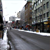
Step Two.
The icon was looking slightly washed out and the colors are a bit dull, so I got a Hue/Saturation adjustment layer.
My settings were:
Hue: 0
Saturation: +35
Lightness: 0
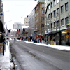
Step Three.
It still looks really boring. So I get a Color Balance adjustment layer and attempt to add some colors to the icon.
Midtones: -19, +10, -17
Shadows: +25, -1, +15
Highlights: -15, -2, -9
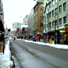
Step Four.
It's starting to look a bit better but there's a lack of red, so I get a Selective Color layer to get some reds in, and also make the colors warmer
and more saturated.
Reds: -100, +100, +100, 0
Yellows: -100, -30, +100, 0
Greens:: +100, +100, -100, 0
Cyans: +100, -41, +100, 0
Blues: +100, +100, -100, 0
Neutrals: -8, +3, +10, 0
Blacks: -28, -1, 0, +16

Step Five.
While it's looking much better, I still want more reds, so there's a warmer hue. Get another Selective Color layer.
Reds: -55, +22, +91, 0
Yellows: -46, 0, +31, 0
Greens: +100, +26, -100, 0
Blues: +100, +19, -100, 0
Whites: -40, -23, -41, -36
Neutrals: -16, 0, +8, 0
Blacks: -28, 0, 0, +27
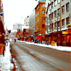
Step Six.
Almost there - just one more Hue/Saturation layer to make things more dominant.
Hue: 0
Saturation: +12
Lightness: +8
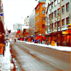
Step Seven.
To get a little more contrast, get a Levels adjustment layer.
Input Levels: 24, 1.12, 247

Step Eight.
Now all we really need is the text, so I created a rectangular white box with the Rectangular Marquee tool and filled it with white.
The text was in Georgia, size 9. Tracking was set to 300.
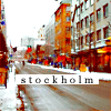
Viola.
[/blockquote] |
|
|
|
Post by sebl on Jun 25, 2008 23:39:19 GMT -5
ok so i got toatlly bored and thought i'd try out a few of these tutorials and i tried alegra’s, now i don't have Photoshop i have Digital Image
and..

this is what i got err tis a bit dark ...
|
|
|
|
Post by alegra bell on Jul 8, 2008 17:10:09 GMT -5
ICON TUT
translatable, no selective color. Easy. We'll be going from  to to 
o1. First of all, Crop, sharpen, all that.

o2. Duplicate the layer, set it to screen, 100 percent.

o3. Duplicate the base again, bring it to the top, and set it to multiply, 100 percent.

o4. Duplicate the bottom layer, for the last time, bring it to the top, and set it to soft light, 100 percent.

o5. Next, take this texture, which i got from tralala_icons of LIVEJOURNAL.com , and set it to darken, 100 percent.

o6. Make a new fill layer, on my psp 11, i have to create a new raster layer and fill it, but whatever. Get a new color layer, and fill it with #cec0c0 , and set it to darken, 100 percent.

o7. Make another color layer, fill it with #3d0001 , and set it to exclusion. You can leave it at a 100 percent if you want, but I set mine to 75 percent.

o8. That coloring is done. Now for more textures ^^.
I take this tiny text/texture, which i got from nineteen07 at livejournal, and set it to screen, and position it somewhere where I liked it.

o9. The final texture and we're done! I grabbed this one, i don't know where I got it from, sorry. I forgot to label it ><, and set it to screen, and placed it where I wanted it. You can leave it at 100 percent if you want, but i put my opacity at 60 percent.

and we're done ^^ If you have any questions, feel free to ask, and show results, all that, yadayadayada.. :]
BTW, good job, you two ♥
|
|
|
|
Post by maxim on Jul 17, 2008 6:59:48 GMT -5
Algera, I'm having ago at your Hannabeth sig - problems finding "Merge", other that the layers one! Is there another one? I trying it out on PSP 9, but I have XI at home and I'm going to have a try on that one later!
|
|
|
|
Post by henri l'armour, on Jul 26, 2008 7:08:37 GMT -5
I'm not really sure what your question is, Maxim ><
Are you asking how to flatten it?
On PSP11, you right-click on one of the layers and click flatten image. :]
Pretty sure its the same on all the PSP programs? |
|
|
|
Post by emily r a n a stanton. on Jul 29, 2008 18:55:30 GMT -5
Um, so i've been trying out a bunch of these tutorials. Most work with gimp except gimp doesn't have selective coloring unless it does and i can't find it. But anyway, if i have two images one is in color and the other black and white. When i change the colored picture to black and white, the black and white image is always darker(sometimes lighter) I tried burning and dodging the colored image and i tried something else i don't remember what though. is there a way i can make the and black and white image the same shade as the colored one i used black and white on?
|
|
|
|
Post by ronniexo on Jul 31, 2008 4:26:53 GMT -5
Emily; Yeah, Gimp doesn't have selective coloring, sorry about that. >< And then the black and white images... I think the main problem is that your images have different shading, lighting, which is usually the case when they're from two different photoshoots or something like that. There are various ways to change a colored picture to black and white, so you could try some of these to try out the results:
1. Lowering the Saturation of the colored image to 0.
2. Setting a layer directly above the colored image filled with black and set to 'Color' or 'Hue' or 'Saturation' mode.
3. Desaturating the image and then adjusting the brightness & contrast of it using a Brightness/Contrast adjustment layer or a Levels adjustment layer [not sure if you have both].
I'm sure you can find a way there, though! =] [/blockquote] |
|
|
|
Post by ajsimmons on Aug 1, 2008 6:18:23 GMT -5
I had a go at both of Alegra's tutorials and I guess the outcome was good;;
Signature using my RP character:

Icon using RP character:

What do you think? Lol.
|
|